“I Think It’s Too Long, Can You Make It Shorter?” A Phrase I Dread

I do quite a bit of copywriting:

  • email proposals
  • email newsletters
  • sales pages on websites
  • blog articles
  • direct response letters
  • and the occasional fax (I’m joking about the fax, it’s not the nineties anymore)

The pieces of work I create are as long as they need to be and often include all of the following components:

  • Headline: A headline dripping with benefits that leaves the reader hungry to read the rest
  • Highly personalised: In email newsletters I like to mention the recipients first name 7 times. In direct mail my record is mentioning their first name 16 times
  • Chatty and friendly: Written in a one-on-one style as if the two of us were sitting down over a coffee and having a chat. This decreases the distance between you and I
  • Compelling content: That tells a story and focuses on what you get out of the deal. It even addresses your objections before they form in your mind
  • A limited time offer: “Respond before 5pm Friday”, and/or a limited number of customers “Only 10 positions available”
  • A call to action: Eg choose between 3 packages with ascending prices and value. “Call 0800 123 123 to secure your position”

I put my heart and soul into this work.

I work on it like it’s a piece of art. It just has to be perfect before I’m happy to release it on the world.

And time and time again this work pays off, because it generates the responses/action/sales goals that I set for those pieces.

But sometimes, a client comes back and says that dreaded phrase “I think it’s too long, can you make it shorter?”

arrrrgghh

There are 2 reasons why clients say “I think it’s too long”:

  1. Because they are not in the target audience (I’m not trying to sell your services back to you, I’m selling them to your prospects. It’s no wonder you aren’t captivated)
  2. They are bored of simple explanations of what they do. This is what prospects that have never heard of you need, but you might be bored of simplifying your story

Because the fact is, if something is interesting to an individual, they will keep reading and keep reading and keep reading.

They are thirsty for the content, and they can’t stop because it tastes like cool water as they read.

Most novels take 4, 6, 8, 10 hours to read, right?

If you had just started a novel by your favourite author that you’d been waiting months to get hold of, and I told you that I had a one page summary in a sealed envelope and I tried to give it to you would you yell at me “Keep that away from me!! Leave me to read my book in peace!”

Sure you would.

Length isn’t important.

It’s the journey.

It’s the story.

So the next time you read an article in a newspaper, or an email newsletter, or draft copy from someone who is helping you write an email newsletter, and your first thought is “I think it’s too long”. Check yourself.

Are you in the target audience?

If not, keep your opinion to yourself.

5 Ways Your Potential Clients May Be Reacting To Your Contact Form (And What You Can Do About It)

Do you use a contact form on the “Contact Us” page on your website?

If so, check this list of common mistakes to see if you are making your prospective clients angry or just turning them away.

5 Ways Your Potential Clients May Be Reacting To Your Contact Form (And What You Can Do About It):

1. “That contact form is sooooo long! I feel tired just looking at it!”

  • Does everyone type at 60 Words/Minute like you? No. Most people I know type with one finger. A long form looks like half an hour of work to them
  • It doesn’t matter if some fields are “not required”. Visitors don’t notice the little asterix, and they feel obliged to fill in every field because of “form momentum”

What you can do:

  • Trim back your fields to the absolute bare minimum. Do you really need their postal address, physical address, all their phone numbers and date of birth? No you don’t.

2. “Bah! Another error message: ‘Syntax of field 624 is invald’? WTF?”

  • If prospects take the time filling in your form, click submit and they get an error box in their face they will get angry and hate you
  • It’s worse if your form validation script doesn’t highlight the field in red and provide helpful guidance so the prospect knows exactly what to do next. They will feel lost and confused
  • They will subconsciously ascribe these negative feelings to you. Is that the right way to start a business relationship?

What you can do:

  • Keep the form super short. Less fields = less potential error messages
  • Lighten up on the validation

3. “Does this contact form even work?”

  • This is a fear of the message not being delivered at all
  • Sometimes when you click the “submit” button does it feel like you are launching your message into space and you’ll never see it again? That’s because experience tells us that is exactly what we are doing. Sometimes the contact form is broken and no-one find out for months

What you can do:

  • Regularly test that the contact form is working

4. “How long will I have to wait before I hear back?”

  • Closely related to the fear of the message not being delivered at all is waiting an age for a response
  • Perhaps part of the problem is that most contact forms go to generic email addresses like “info@yourdomain.co.nz”. How motivated is the recipient of emails sent to this generic address to respond fast when the message isn’t even addressed to them? If Bob gets these messages, which will he reply to first: Emails addressed to Bob, or emails addressed to “info”?

What you can do:

  • Send your contact form messages to a real person not just “info” (yes, it may need updating when your staff change)
  • Make a promise in your email receipt “we will respond within 1 normal business day. If you don’t hear from us, please call our tollfree hotline”

5. “What did I say? When? To Who? I can’t remember!”

  • When you send a message from your own email system you can always check your “sent” box later to check:
    • That it was actually sent
    • Who it was sent to
    • The date/time
    • and most importantly: what you said
  • With a contact form you get nothing. Sometimes you might get an email receipt that says “thanks for your message, we’ll contact you soon” – yeah right.

What you can do:

  • Send the prospect a copy of their own message “here’s a copy of your message for your reference”
  • Let them just click on your mailto hyperlink so they can send their message from their own email system

What Else You Can Do To Improve Your Contact Form

Double check that you provide a clear “mailto” link for your email address like this: “sheldon@marketingfirst.co.nz“.

If you don’t, you may be forcing your web visitors to use your contact form and face all the problems listed above, or they may just give up and leave, and take their business to your competitors.

What Email Address Does The IRD Student Loan Newsletter Come From? MajorDomo@ird.govt.nz Of Course!

That is so weird.

IRD has just stopped publishing their Student Loan info newsletter.  I got the last ever hard-copy today.

From now on, if you want to know what’s going on with your student loan you have to sign up to the e-newsletter.

So that’s what I did.

And I just got an automated confirmation email to welcome me to the newsletter list.

The email address it came from was MajorDomo@ird.govt.nz.

Can you make any sense of that?

Is it the name of a famous student war hero?

Is DOMO an acronym for something like “Dunk Oreo’s Monthly Ok”?

Is it the IT departments little joke?

Do You Make Your Most Loyal Customers Furious?

I have been with Genesis Energy for 12 years. I’ve spent about $20,000 – $25,000 with them in that time.

6 months ago they did something that made me furious, and this morning they did something else.

That’s twice in 6 months!

Will they get the next $20,000 that I am likely to spend on electricity in the next 12 years?

(Yes, probably. I’m too lazy to change, and they’re the cheapest)

What made me furious 6 months ago?

I had been receiving my bills by email as attached pdf’s for 5 years (I think they were the first to start doing it). It was an awesome setup. I felt that I was doing my thing for the environment, and it was super convenient.

But that all changed 6 months ago.  Genesis announced that they were no longer doing that (which took 1 click to view), they now required this process:

  1. Visit the Genesis Energy website
  2. Have several attempts at remembering your username and password
  3. Click about 3 levels into the account to find your bill
  4. Download the pdf
  5. Repeat this process every month

I complained at the time and asked them to keep my set up as it was. They explained they couldn’t.

Oh well.

What made me furious this morning?

I got an email this morning telling me to sign up for Brownie points. The thing is, I am already enrolled. – FAIL!

Why send this email out to people it is not relevant to? It’s confusing.

Anyway, I thought I’d hit “reply” button and let them know I’m already enroled. But the email bounced because it is “no-reply@genesisenergy.co.nz”. – FAIL!

The “reply” button is the most natural button in the world to press but Genesis Energy has disabled it.  It’s like a slap in the face. It says “we don’t want to hear from you so shut up”.

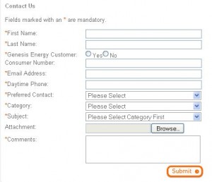
So I clicked on the “contact us” hyperlink at the bottom of the email instead and got this contact form:

genesis-energy-contact-form

What do you notice about this contact form?

There are 11 fields! – FAIL!

How much information do you need from me just to send a friggen email?

Worst of all, the Consumer Number is compulsory so I have to dig up an old invoice to find my consumer number (surely my email address is enough to find me in the system?). – FAIL!

What’s the point of this rant?

My point is this. What are you doing to annoy your most loyal customers?

Is the door to your restaurant sticky?  Is it hard to find your phone number on your website? Do you impose a system on your customers that makes it easy for you, but annoying for them?

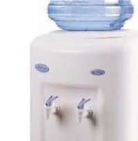
What is the second tap on a water cooler for? I don’t understand

water-cooler-tapsHave you come across a water cooler like the one shown in this photo?

(see photo on right)

And like me, have you wondered which tap to use?

Sometimes one tap is colour-coded red to indicate hot water.  Sometimes one is white, the other is blue to indicate cool water and cold water (which is which? I don’t know).

But often they are the same colour.

Why are there 2?

So 2 people can be served at the same time?

There is hardly room for that.

I don’t know the answer. It’s confusing.

Does your product or service confuse your customers?

Do they wonder why you’ve set things up the way you have, but stop short of asking you questions because they don’t want to look like a fool?

The point is, you wouldn’t know.

So take a fresh look at your brochures, your signage, your website, your business cards.

Is there enough introductory information there for people who have never heard of you, to make sense of what you are offering, and quickly determine what’s in it for them?

If not, fix it today.

That would be as refreshing as a cool drink of water on a hot day.

Does your webpage content need to be “above the fold”? The Myth Exposed

In the 90’s that was a good rule of thumb: If the content for your webpage fills more than the browser window and forces people to scroll down to read it, split it up on to multiple pages.

That is no longer the case, for 3 reasons:

  1. People are used to scrolling down the page to see more content (and so use the right side of the touch pad on their laptop, the page down/up buttons, move the scroll bar with their mouse, or use the mouse scroll wheel)
  2. The most common way to scroll down is by using the scroll wheel on a mouse. Most people have a mouse with a scroll wheel
  3. More people are used to skim reading web content so if you split your content onto “page 1”, “page 2”, etc, you will slow them down, annoy them and lose them as visitors

What do you need to be aware of however, is “the false bottom”.

The false bottom is where elements on your webpage do not create an expectation that there is more content below. (You can’t rely on the user to notice that position of the scroll bar on the right hand side of the browser window.)

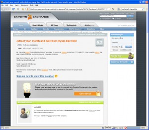
expert-exchange-screenshotHere is a screenshot of ExpertsExchange.com which shows a “false bottom”.

In this example the user visits the page expecting an answer to their question (in fact Google helped build this expectation by providing a link to the page in the first place), but the user is frustrated to find that they will have to sign up to view it!

But in fact, all they have to do is scroll to the bottom of the page to view the answer.

The promotional message “sign up now to view this solution” and the visual element of the lightbulb in the grey box have created a false bottom so the user doesn’t realise there is more content below.

(In this particular case it seems ExpertsExchange.com have done this on purpose to motivate visitors to become subscribers, while providing the actual answer for Googlebot to index)

In summary, do not be concerned with the length of your web pages. Instead, learn how to write for the web, and be conscious of not creating “false bottoms”.

Essential Steps for Building a Website That Generates Business For You

8 Essential Steps:

  1. Define the most important action that you want the audience to take. Is it filling in an enquiry form? Call your toll free number? Download an information pack?
  2. Make it dead easy for them to take that action. 1 click or 2 clicks. Not 5 clicks
  3. Make your forms super short. Ask for essential information only. Not their age, not their gender, not even their address (if you aren’t posting them something, don’t ask for it). And it doesn’t matter if some of your form field aren’t compulsory, if it looks too long it will turn people away
  4. Ensure your code is search engine friendly:
    • Clean urls like “this-is-a-page-about-how-to-do-stuff.html” rather than “index.php?ss=2&s=abc”
    • Clean html code, eg use H1, H2, H3 tags instead of heavily formatted paragraph tags
  5. A stripped down CMS for commonly updated content (like blog entries, articles, products). Lock down other pages so you’re not tempted to wreck them with crazy fonts and colours
  6. Write for the web” by formatting all your content with headings, sub-headings, short paragraphs (none more than 3 sentences), bullet points, numbered lists, and internal hyperlinks
  7. Follow usability guidelines, such as:
    • Hyperlinks that look link hyperlinks. Buttons that look like buttons
    • Breadcrumbs so when the users deep-link they can quickly figure out where they are
    • Disable the hyperlink in the navigation if the user is already on that page
    • And just about everything else website usability guru Jacob Nielsen recommends
  8. Choose a web site developer who knows about all this stuff

Continue reading “Essential Steps for Building a Website That Generates Business For You”