What is the second tap on a water cooler for? I don’t understand

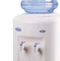
water-cooler-tapsHave you come across a water cooler like the one shown in this photo?

(see photo on right)

And like me, have you wondered which tap to use?

Sometimes one tap is colour-coded red to indicate hot water.  Sometimes one is white, the other is blue to indicate cool water and cold water (which is which? I don’t know).

But often they are the same colour.

Why are there 2?

So 2 people can be served at the same time?

There is hardly room for that.

I don’t know the answer. It’s confusing.

Does your product or service confuse your customers?

Do they wonder why you’ve set things up the way you have, but stop short of asking you questions because they don’t want to look like a fool?

The point is, you wouldn’t know.

So take a fresh look at your brochures, your signage, your website, your business cards.

Is there enough introductory information there for people who have never heard of you, to make sense of what you are offering, and quickly determine what’s in it for them?

If not, fix it today.

That would be as refreshing as a cool drink of water on a hot day.

Pay What You Want

You’ve heard about the restaurants in Auckland where you can pay whatever you feel is right for your meal after you’ve eaten it?

Well how about paying what you want for a night for two in a deluxe suite? It’s only US$19 a night… bed not included.

That’s in San Diego’s at the Rancho Bernardo Inn.

The full pricelist:

logontopDeluxe accommodation with breakfast for two for US$219 per night.
Or….

  • $199 without breakfast
  • $179 without honor bar
  • $159 without A/C or heat
  • $139 without pillows
  • $109 without sheets
  • $89 without lights
  • $59 without linens
  • $39 without toiletries
  • $19 without bed

How can this help your business?

Can you drum up some free media air time by doing something crazy with your pricing?

Can you change your pricing to appeal to the rich and the poor at the same time?

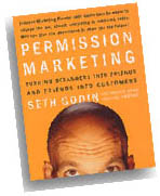
Permission Marketing by Seth Godin – Have your customers given YOU permission?

My Notes on “Permission Marketing” by Seth Godin:

My Summary:

Rather than write an advertisement in a feeble attempt to get people to buy (when they have never even heard of you before), simply ask them for permission to send them more information (a free report, a free sample, a list of “common mistakes” in your industry).

And in that information you send them, ask for permission to send them more.

After you build up a relationship in this way over time, then you can start selling.

Continue reading “Permission Marketing by Seth Godin – Have your customers given YOU permission?”

How To Write For The Web

Writing for the web is pretty simple on the surface, but the switch from writing for print to writing for the web is a difficult one for many people.

Here are some writing-for-the-web techniques to get you started:

1. Use long descriptive headlines, sub headings and sub-sub headings

  • People commonly skim read web content very quickly, and they are attracted to headlines to get the gist of the pages content

2. Use bullet points and numbered lists

  • Short, punchy bullet points are easy to digest, and divides content into easily managed chunks
  • There is nothing more boring to a user than a long paragraph of text, it screams “I’m too long to read!”

3. Use very short paragraphs

  • 1 sentence paragraphs on the web are fine (they are frowned upon in print)
  • 2 sentence, and 3 sentence paragraphs are good
  • 4 or more sentences in a paragraph is no good

4. Use internal hyperlinks

  • If you have another webpage that explains a phrase or idea in more detail, link to it
  • It’s good for the user because they know where they can go next, and its good for search engines

5. Use occasional bolding and italics to emphasise

  • But don’t over do it!

Do you need help re-writing your content for the web?

Contact us today or book a free 45min consultation now

Does your webpage content need to be “above the fold”? The Myth Exposed

In the 90’s that was a good rule of thumb: If the content for your webpage fills more than the browser window and forces people to scroll down to read it, split it up on to multiple pages.

That is no longer the case, for 3 reasons:

  1. People are used to scrolling down the page to see more content (and so use the right side of the touch pad on their laptop, the page down/up buttons, move the scroll bar with their mouse, or use the mouse scroll wheel)
  2. The most common way to scroll down is by using the scroll wheel on a mouse. Most people have a mouse with a scroll wheel
  3. More people are used to skim reading web content so if you split your content onto “page 1”, “page 2”, etc, you will slow them down, annoy them and lose them as visitors

What do you need to be aware of however, is “the false bottom”.

The false bottom is where elements on your webpage do not create an expectation that there is more content below. (You can’t rely on the user to notice that position of the scroll bar on the right hand side of the browser window.)

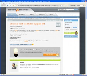
expert-exchange-screenshotHere is a screenshot of ExpertsExchange.com which shows a “false bottom”.

In this example the user visits the page expecting an answer to their question (in fact Google helped build this expectation by providing a link to the page in the first place), but the user is frustrated to find that they will have to sign up to view it!

But in fact, all they have to do is scroll to the bottom of the page to view the answer.

The promotional message “sign up now to view this solution” and the visual element of the lightbulb in the grey box have created a false bottom so the user doesn’t realise there is more content below.

(In this particular case it seems ExpertsExchange.com have done this on purpose to motivate visitors to become subscribers, while providing the actual answer for Googlebot to index)

In summary, do not be concerned with the length of your web pages. Instead, learn how to write for the web, and be conscious of not creating “false bottoms”.

Do you make the mistake of putting your brand and logo at the top of your print ads?

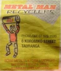
metal-man-recyclersIf so, you are not alone.

But even so, STOP IT!

Here is an example in this weeks edition of the Bay News for Metal Man Recyclers, Koromiko Street, Tauranga.

This approach is classic, and very common…  But still wrong!

The problem is there are 3 audiences:

  1. The business/advertiser (who is paying for the ads)
  2. The graphic designer who designed the ad
  3. The potential customer (people who read the Bay News in this case)

Each audience has a different agenda, and unfortunately the potential customer doesn’t get a say so the advertiser and the graphic designer work together to create the ad.

That’s a shame because the potential customers opinion is the only one that counts!

The graphic designer knows that if they create an ad with the advertisers brand name and logo at the top, the advertiser is going to be happy and will pay the bill.  The graphic designer doesn’t care if the ad works or not, that’s not their business, it’s not their problem, they just do what they are told.

If your advertisement doesn’t work, what’s the point? It’s a waste of money if this ad doesn’t get customers in the door isn’t it?

The key to a great ad is a great headline, because it achieves 3 things:

  1. It filters out non-customers (if the headline doesn’t appeal to them, they move on. Fine, let them go!)
  2. It tells potential customers what’s in it for them (that’s all they care about. They don’t care about your brand, they care about what they can get from you)
  3. It hints at what action the customer can take

With those ideas in mind, I propose the following headlines for this ad:

  1. Old Car dumped on your lawn? We’ll take it away for FREE
  2. Got old car batteries, lead pipes, copper wire, aluminum cans etc? We pay cash for scrap metal.  So check under your deck and in your shed today

So my message to Metal Man Recyclers, Koromiko Street, Tauranga is:

Change your headline to one of these, and put your brand name at the very bottom and only put your logo there if there is room.

How many reward cards do you have in your wallet?

rewards-cardsI’ve got a truckload. I’m pretty good a throwing receipts away, but I’m a sucker for a bargain so keep many rewards cards.

The most common type is “buy 9 cups of coffee, get your 10th cup free”.

From VTNZ Hewlets Road I’ve got “get 2 WOF’s, get $5 off the third, get 2 more WOF’s, get $10 off the fifth.

From BP Maunganui Road (beside the fly-over) I’ve got “fill your gas bottle 9 times, get the 10th free”

From Bakers Delight on Owens Place I’ve got “spend over $4 5 times, get a loaf of bread free”

From Subway I’ve got a Subcard for 20c credit for every 6 inch sub I purchase.

And the more famous nationwide examples would be Fly Buys and Air Points.

Here’s the trick: Some of these actually save me money (I would probably go to bakers delight anyway), but others are a real waste of time (it will take me 5 years to need 9 bottles of LPG), but I can’t resist the promise of saving money at some point in the future.

And in the meantime, I’m carrying around their brand name in my wallet. Their brand name is front of mind, because everytime I open my wallet I am reminded of it.

Is it the same for you? What cards have you got in your wallet?

How can you make this hugely successful tactic work for your business? Can you issue a rewards cards?

What ever you do, don’t be tempted to write an expiry date on them. The couple of times that happened to me it made me really mad and you don’t want loyal customers thinking dark thoughts about you!