The 5 Questions Your Website Has 60 Seconds To Answer

It’s likely that today you will get a few visitors to your website. Congratulations!

Did you know you have 60 seconds or less to deliver answers to their questions or they will wander off to your competitors?

Here are the top 5 questions your website visitors are wondering.

Does your website answer these 5 questions? How quickly? What improvements could you make?

5-questions-60-seconds-video-thumb

1. “What do you do?”

Your website has 5 seconds to answer this question.

Do you have a single sentence in a large font near the top of the page? Continue reading “The 5 Questions Your Website Has 60 Seconds To Answer”

Your New Website Says “Under Construction” or “Coming Soon”? 3 Reasons That’s A Disaster

I love purchasing a new website address, don’t you?

(A website address is also known as a “domain name”, or a “url”)

I’ve purchased about 60 website addresses over the last few years. For clients, friends, and for myself.

I get the same rush of adrenaline every time I do it.

It’s so exciting because it’s much an amazing opportunity.

The opportunity is that you can write a message and expose that message to the whole world!

Wow!

Continue reading “Your New Website Says “Under Construction” or “Coming Soon”? 3 Reasons That’s A Disaster”

Own A Cafe, Restaurant, Bar But Have No Website? Get One Before 2013

If you don’t have a website for your Cafe, Restaurant or Bar, then take some comfort in the fact that you are not alone.

Did you know that only about one third (to one half) of New Zealand’s Cafe’s, Restaurant’s and Bar’s have a website?

The 5 Most Common Objections I Hear From Owners:

When asked why they don’t have a website, owners typically come up with one or more of the following objections.

(Have similar thoughts gone through your head? If so, it’s time to update your thinking.)

1. “I don’t know how, I’m not good with computers”

  • Then learn. Or at least find a family member or staff member to take care of the basics.

2. “Websites cost too much”

Small Business Website: Do It Yourself For Only $141.50

If you don’t have a website for your small business, then take some comfort in the fact that you are not alone.

Did you know that only about one third (to one half) of New Zealand businesses have a website?

The 5 Most Common Objections I Hear From Owners:

When asked why they don’t have a website, owners typically come up with one or more of the following objections.

(Have similar thoughts gone through your head? If so, it’s time to update your thinking.)

1. “I don’t know how, I’m not good with computers”

  • Then learn. Or at least find a family member or staff member to take care of the basics.

2. “Websites cost too much”

  • Wrong. They can cost as little as $141.50+gst/year. I’ll tell you how in a moment.

3. “I don’t think I’ll get a return on the investment”

  • Wrong. A simple website is the best return on investment you can get. It beats all other advertising options. And the payback gets better and better the longer you’ve got a website

4. “That’s not how customers choose a business”

  • Wrong. It may not be how you choose a business but it is the way that hundreds of thousands of New Zealanders do it. Plus more every day

5. “I’m too busy, I don’t have time to keep it updated”

  • Keep the content simple. Don’t do anything fancy. Delegate to family or staff.

The 4 Best Reasons To Have An Official Website:

Ask owners who do have a website why they do, you might hear things like…

1. “Our website is the official place where I own and control the content”

  • That’s right. No longer are you at the mercy of business directories like Finda who display your brand however they like

2. “Our website is the official place where the public can be confident and trust the info because they know we wrote it”

  • That’s right. Otherwise you are annoying potential customers by forcing them to use a business directory like Finda that has missing, incomplete or just plain wrong details. Wouldn’t it be better if they went to your official website instead?

3. “We noticed that the public are increasingly using the internet at home, at work and even on their phones wherever they are, to choose a business”

  • That’s right. Having your own website means you get to appear in search results and get a chance at being chosen. Isn’t that better than no chance at all?

4. “We’d prefer to have an upset customer contact us via our website rather than complain publicly on Facebook or a business directory”

  • That’s right. Not having an official website effectively forces upset customers to vent their frustration on platforms like Facebook where you have zero control and you won’t hear about the complaint until it’s too late to fix it, or never hear about it at all.

What You Should Do Next:

If you are a small business owner and you don’t have a website yet, here’s the 5 steps you should take next:

The 5 Simple Steps To Take If You Want An Official Website

1. Go to 1stdomains.co.nz and purchase your website address for $21.50+gst/year

  • Get a .co.nz (not a .net, or .net.nz or anything else!)
  • Set the DNS settings to ns1.ramsu.co.nz and ns2.ramsu.co.nz

2. Go to the website hosting company Ramsu.co.nz and purchase hosting for $120+gst/year

  • Type in the domain name you purchased
  • Create a database using the admin panel and write down the username and password

3. The next day, go to WordPress.org and download the latest version of their free website building software

  • WordPress is high quality Content Management System that is easy to use. If you get stuck, any problem can be solved with a Google search
  • Follow the set up instructions written on WordPress.org called “the famous 5 minute install

4. Login for the first time and start writing content

  • Keep it simple. No fancy stuff. Just the basics that prospective customers want to know
  • Phone number + address + Google Map + your products and services + testimonials. That’s it.
  • If you check your email once a week, don’t you dare put your email address on your website

5. Register your new website address with Finda.co.nz (and a few other free business directories too)

  • This just gives Google a kick to announce that your website is up and running

Still Too Hard?

Then ask a family member or staff member to help.

They teach this stuff in primary school now, so find a 10 year old and get on with it.

2 Vital Elements The “About Us” Page on Your Website May Be Missing

If you pay any attention to your webstats, you may have noticed that your About Us page is one of the least visited webpages on your website.

This doesn’t mean it is unimportant. It is vitally important.

The low traffic means that each prospective customer will visit it only once, so you’ve got one chance to give them what they came for.

So, what are they looking for?

When prospective customers visit your About Us page they are looking for 2 things:

  1. Credibility cues
  2. A story

3 Ways how you can build credibility on your About Us page

  1. They want to know you are legit, with a real physical address (preferably nearby to them, and at least in the same country)
  2. Use real names (not “us” and “we”). Certainly name everybody the customer may be in contact with, and it’s good to name all the support people too. Plus name the founders/managers.
  3. Use official company names (not just your trading-as name) so they know they can check you out with the Companies Office if they wanted to

3 Tips for how you can tell a story on your About Us page

  1. Lots of detail. On most web pages you need to be quite brief and get to your point quickly, but on the About Us page the rules are relaxed a bit because the web visitor is asking for a story so you can write as much detail as you like. Divide your “About Us” content into sub-pages if you need them eg “History”, “Founders”
  2. Define your target customer (don’t try and be all things to all people). The idea is to be specific so your target customer sees themselves in your description and has confidence you will serve them well. And those outside your target will still see elements that match them so you win both ways
  3. Convey your passion for helping people like them, perhaps you have an interesting story of why and how you got into this business that communicates that passion?

What more tips can you suggest for About Us pages? Add them to the comments below.

Expired Domains: Picking Fruit From A Graveyard Of Failed Ideas?

Occasionally, just for fun, I spend a few minutes browsing www.ExpiredDomains.co.nz.

Expired Domains lists all .nz domain names which have expired and are in the .nz registry’s official 90 day pending release period.

But what I find most interesting about this list is that at first glance, many of them look like really good names!

Every single time I look at this list of Expired Domains, I have these same three reactions:

Reaction #1:

“oooo, I can’t believe that xyz.co.nz is available! And it’s only $24.50! What a freakin bargain, I’ll set up a website and make millions! I simply can’t lose!”

Reaction #2:

I do a double-take.

“wait a second… they are on this list of expired domains because someone, like me, thought they had potential.  But that person failed to make any money from it at all, and let it expire rather than waste another $24.50 on it to renew it… hmmmm”

**Warning Bells!!**

“calm down Sheldon, calm down, I don’t have to whip out my credit card right now and buy it before someone else gets a chance…”

Reaction #3:

“Oh, in all that excitement I forgot that it doesn’t matter what your domain name is. What is most important is your content!”

What do you think?

The next time you are tempted by an expired domain, pause, and remember that you are picking fruit from a graveyard of failed ideas.

Add your comments below:

7 Ways To Get Your Website Working Harder For You

  1. Is your website search engine friendly? Find out with a free review
  2. Is your website listed in the best, free NZ directories? Check the list
  3. Have you completed the 8 essential steps for getting a website working for you?
  4. Have you tried advertising using Google Adwords? Here’s how its done
  5. Have you got a copy of the 2009 ebook “How to Optimise Your New Zealand Website For Search Engines” which is now free?
  6. Does your website need a complete overhaul? Get it done for only $1800
  7. Does your business need fresh eyes and fresh ideas? 45 minutes of advice with a marketing professional is yours, for free

Cheers,

Sheldon Nesdale
Phone: (07) 575 8799

Should I Give My Ebook Away For Free Or Require An Email Address?

I faced this decision 4 months ago over on my www.SearchEngineGuide.co.nz website (where I focus on SEO and Google Adwords).

I had just decided to give away the 2009 version of my ebook “How To Optimise Your New Zealand Website For Search Engines” for free.

My choices were to:

  1. Ask for a name and email address and email the ebook
  2. Hyperlink directly to a downloadable Pdf

I chose option #2: Hyperlink.

The pros and cons were as follows:

  • Con: I would have no idea who is reading it because I wasn’t collecting names or email addresses
  • Pro: I was setting my content free with the potential to go viral
  • Con: I had no way of contacting the people that downloaded it to tell them about my next version, or to make them a special offer on my other services
  • Pro: It removed a barrier to trialling my products & services

The pro’s were great but the con’s are very heavy.

And 4 months later I have buckled under their weight.

So 5 days ago I put the sign-up form back in place.

It just asks for first name and email address. That’s it. Pretty easy.

And I already have 7 email addresses in my list that I can work with!

What will I do next time: link directly to the ebook, or require an email address?

I’ll ask for the email address and first name.

And in the ebook itself I’ll encourage these people to pass the ebook on to whoever else they think would be interested.

That way, I get the viral thing happening but I still get to keep in contact to these influencers with my offers!

Tauranga Website Design: List of ALL The Tauranga Website Designers

I heard a rumour that Tauranga has a disproportionately high number of web designers.

It turns out that this rumour may be true.

List of ALL Tauranga Website Designers

  1. www.Firstbyte.co.nz
    [Portfolio | Pricing]
  2. www.GoodWebsites.co.nz
  3. www.WebsiteResults.co.nz
  4. www.Totali.co.nz
  5. www.Cohesion.co.nz
  6. www.ReserveGroup.co.nz
  7. www.BoldHorizon.co.nz
  8. www.CucumberSoftware.com
  9. www.IconAdvertising.co.nz
  10. www.Xeno.co.nz
  11. www.Markos.co.nz
  12. www.InboxDesign.co.nz
  13. www.VoltMedia.co.nz
  14. www.Moca.co.nz
  15. www.Reverb.co.nz
  16. www.aDesignWeb.co.nz
  17. www.DigitalEffects.co.nz
  18. www.e-Koncept.co.nz
  19. www.Enform.co.nz
  20. www.iLook.co.nz
  21. www.1stWeb.co.nz
  22. www.TaurangaWeb.co.nz
  23. www.DataDog.co.nz
  24. www.rbWebWorks.com
  25. www.Pixelar.co.nz
  26. www.MediaInteractive.co.nz
  27. www.Martian.co.nz
  28. www.WickedEye.co.nz
  29. www.GoldFishInteractive.co.nz
  30. www.StudioFour.co.nz
  31. www.Spotya.co.nz
  32. www.WakaDigital.co.nz
  33. www.2Qik.co.nz
  34. www.i360.co.nz
  35. www.xsv.co.nz
  36. www.WebDesignPeople.net
  37. www.SmartRange.co.nz
  38. www.WaveDesign.co.nz
  39. www.WoodsCreative.co.nz
  40. www.Sparx.co.nz
  41. www.DesignJuice.co.nz
  42. www.SellNet.co.nz
  43. www.itMatrix.co.nz
  44. www.DuneWeb.co.nz
  45. www.FishBone.co.nz
  46. www.Wild-Designz.co.nz
  47. www.WebDesign-nz.com
  48. www.Dzina.co.nz
  49. www.FriendlyWeb.co.nz
  50. www.pcAlert.co.nz
  51. www.Smoother.co.nz
  52. www.NewMedia.co.nz
  53. www.PulseCreative.co.nz
  54. www.Forge.org.nz
  55. www.Emagine.co.nz
  56. www.nzdh.co.nz
  57. www.PixelPilots.com
  58. www.eimage.co.nz
  59. www.TopshelfDesign.com
  60. www.AardvarkWeb.co.nz
  61. www.Devcich.co.nz
  62. www.BlueFlame.co.nz
  63. www.ComputerEnterprises.co.nz
  64. www.AcrePC.co.nz
  65. www.IgniteGraphicDesign.co.nz
  66. SavantCreative.pro
  67. www.ComputerHelpGirl.co.nz
  68. www.DubDot.co.nz
  69. www.Communique.co.nz
  70. www.NotionLab.co.nz
  71. www.Jero.co.nz
  72. www.PrintAndWeb.co.nz
  73. www.DevFX.co.nz
  74. www.MatthewHattie.com
  75. www.WebEngage.co.nz
  76. www.Inspyre.co.nz
  77. www.ClarityWeb.co.nz
  78. www.ReidDesign.co.nz
  79. www.FreeDIYWebsites.co.nz
  80. www.DotPerformance.com
  81. www.TheGalaxy.com
  82. www.EquinoxDev.co.nz
  83. www.GoLoud.co.nz
  84. www.CreativeQ.co.nz
  85. www.WildFlare.co.nz
  86. Alcantelado.com.br
  87. www.RocketBug.com
  88. www.AppThat.co.nz

Is there a Tauranga Website Designer missing from the list?

If there is a Tauranga website designer missing from the list, please add it to the comments below.

Who Owns The Tauranga Domain Names?

I love lists.

(And Google loves lists – there’s a free SEO tip for you!)

So here is my list of Tauranga domain names, who owns them, and which ones are still for sale:

New Zealand (.nz) Domain Names

  1. www.Tauranga.govt.nz – Official website of Tauranga City Council
  2. www.Tauranga.org.nz – Official website of Tauranga Chamber of Commerce
  3. www.Tauranga.school.nz – Official website of Tauranga Primary School
  4. www.Tauranga.co.nz – Privately owned directory of Tauranga businesses
  5. www.Tauranga.net.nz – Owned by EOL, redirects to EOL website
  6. www.Tauranga.geek.nz – Available
  7. www.Tauranga.gen.nz – Available
  8. www.Tauranga.maori.nz – Available
  9. www.Tauranga.iwi.nz – Available

International Domain Names

  1. www.Tauranga.net – Owned by local man Glen Cooney who likes fishing
  2. www.Tauranga.org – Official website of a local Korean church (thanks to Justin for clearing that up)
  3. www.Tauranga.com – No website, just ads
  4. www.Tauranga.tv – No website, just ads
  5. www.Tauranga.biz – Available
  6. www.Tauranga.info – Available
  7. www.Tauranga.cc – Available
  8. www.Tauranga.mobi – Available
  9. www.Tauranga.ws – Available

Generating Revenue By Subscription – Free To Start With And Then Start Charging? Does It Work?

Are you tempted to start charging for access to your website?

Maybe it’s a blog, maybe it’s news, maybe its whitepapers in your area of expertise.

If the revenue model for your website is by subscription you have 3 primary choices:

  1. Free content
    • You ask for email addresses, but you don’t demand them for access
    • The incentive for providing the email address could be a weekly digest of new content, special offers/promotions etc, and a sense of belonging to a club
    • Advertising would be necessary to cover costs
  2. “Freemium” content
    • Most of the content is free but access to certain articles (perhaps the archive) is accessible only with a Premium subscription
    • Example: NZ’s Consumer Magazine (some articles are free, most reports are behind the PayWall)
  3. The “PayWall”
    • Erect a paywall right from the start. If visitors want to see your content, they have to pay
    • Example: NZ’s National Business Review

The question is: Can you use the “Free” model to generate a huge database of subscribers and transition them to “Freemium” or “PayWall”?

This is of course what many newspapers are trying to do with their news websites, but I don’t care about them, I care about you – could it work for your website?

I don’t envy you if you are facing that decision right now. When deciding when to flip the switch you must to worried that you’ll cut off your growth rate.

Have you been on the receiving end of one of these changes? Your favourite website suddenly flips the switch and demands you pay them for access?  Did you start paying or did you search and find that info from another source?

Why Is Harvey Norman Stuck In The 1990’s?

Yes, yes, Harvey Norman does sell the latest technology: Plasma TVs, Laptops, Macbooks, Printers, Digital Cameras etc (at awesome prices), but why oh why do they contradict this image with the following:

  1. Dot matrix printers for printing out your receipt
  2. A 1990’s website
    • With a “splash” page (the home page just has a big photo and link to the rest of the website)
    • The navigation is located in 4 different locations (very hard to figure out where you are. Totally unintuitive)
    • No open hours (forces you to pick up the phone and ask – that is so 1990’s!)
    • No E-commerce (unlike ALL of their competitors: Dick Smith Electronics, Noel Leemings, Bond and Bond)
  3. No social networking activity at all
    • No Facebook page
    • No Twitter account
    • No Linked-in profile

Perhaps Harvey Norman has people in the marketing department (either here in New Zealand or in head office in Australia) fighting for these changes, but because it is a private company run by an old fuddy-duddy family, they are probably very happy with the way they doing their mass media advertising (radio, TV, flyers every day).

What have I missed?

Write your comments below.

Should You Sell Space On Your NZ Website For Banner Advertising?

You might be thinking “hey, we’ve got quite a bit of traffic to our website these days, we could earn easy money by selling space for banner advertisements!”

STOP you silly goose! Here’s why:

5 Reasons NOT To Sell Space on Your NZ Website For Banner Advertising:

1. Because you don’t really want to send potential customers away to someone elses website

I assume you work reasonably hard at getting visitors to your website in the first place? Perhaps you use techniques like:

Why, after all that hard work, would you send them away again as soon as they arrive?

Is the revenue model for your business “to earn 30c by sending a potential customer away to someone elses website”?

For your sake, I hope not.

2. Because it’s not the action you want your web visitors to take

When you were planning your website with your website developer I’m sure one of their questions was “what action do you want your visitors to take?

You may have chosen one of the following:

  • To call your sales team
  • To fill in a contact form
  • To sign up for your newsletter
  • To buy from you online

Was the answer to that question ever “to send them to someone elses website”?

No, of course not.

3. Because you’re not the NZHerald or TradeMe

Banner advertising is suitable to “portal” website which have truckloads of daily visitors and gazillions of web pages.

No?

Well then selling banner advertising space is not a viable revenue generation model for you.

4. Because you don’t want to look cheap

It is common knowledge that the effectiveness of banner advertising has reduced over time.

One of the major reasons for this is a phenomenon known as “Banner Blindness“.

This is a condition where the more you use the internet, the more you are able to determine what ads commonly look like, and where they are likely to be on the page, so you can easily “tune them out” to the point where you are not conscious of their existence at all.

In response to this “Banner Blindness”, many advertisers resort to cheesy techniques designed to interrupt your visitors in the middle of their tasks, such as “CLICK HERE, CLICK HERE!”

The use of these techniques cheapens your visitors experience of your website.

Additionally, you probably spent considerable time and money getting the colour scheme of your website just how you like it?  Well, it is in the best interests of advertisers to create banners that clash with your colour scheme so their ads have a better chance of being noticed.

And if the flashing text and images annoy’s them, who gets the blame for being annoying? Not the advertiser, you. After all, you chose to allow those ads to flash in your visitors faces, so you get the blame. Do you really want to annoy potential customers?

Your website will look cheap. And I’m thinking that’s not the image you were going for?

5. Because it is not as lucrative as you might think

Let’s say for the sake of argument that you choose to use the Google Adsense programme to handle serving your banner ads for you to save you the significant hassle of doing it yourself.

Let’s see what daily revenue you can expect:

  • Daily visitors to your website: Eg 1000/day
  • Typical Click-through-rate for Banner Ads: 0.5%
  • Typical Earnings-Per-Click: $0.30
  • Total Earnings per day: $1.50

It’s just not viable.

It makes even less sense if you are using Google Adwords to get people to your website.  If you are spending an average of $1 to get a visitor to your website and earning $0.30 to send them away, you should be fired.

What should you be doing instead?

Here are a few ideas for how you can improve your website and earn more money than you ever could with banner ads:

  1. Count the number of clicks it takes for a web visitor to take the action you want them to take. Make changes to halve that number.
  2. Reorganise the content of your website around your potential customers goals (i.e. solving the problem they’ve got), rather than around your goals (i.e. selling what you’ve got)
  3. Invest in Search Engine Optimisation so Google sends you potential customers for free

Need More Help?  Need to Generate Better Results From Your Website?

If you have a small-medium sized NZ business, then I can help you with:

  1. Generating more traffic using Search Engine Optimisation and Google Adwords
  2. Converting your web visitors into paying customers

Call me now on (07) 575 8799 or email me for your FREE 45 minute Marketing and Advertising Review.
What’s Your Excuse For Having a Crap Website Or Not Having One At All?

There is no excuse.

If you spend anytime on the internet (and if you’re reading this, you do), then you will come across hideous websites all the time.

Here are 2 I came across in the last 10 minutes:

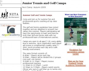
all-about-sports-screenshot1. www.AllAboutSports.co.nz

3 Reasons why this website sucks:

  1. Broken/lost images
  2. It was built with Microsoft Word (which is NOT for website building!)
  3. Most of the links go to mht files which spew unreadable text onto the page

3 Reasons to make this website cool:

  1. It has a pretty cool domain name
  2. It’s a Cambridge based, community website that isn’t trying to sell anything, it’s just providing a service to the community
  3. It’s easy to make a cool website for free using WordPress, so there is no excuse

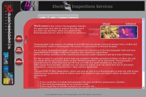
celsius-screenshot2. www.Celsius-Ltd.com

4 Reasons why this website sucks:

  1. It is a .com instead of a .nz, so if a prospect ever sees it in search engine results they will think it’s American
  2. It uses frames which forces the user to scroll in small windows
  3. The text is light grey on red. Very hard on the eyes
  4. “Celsius” is too hard to spell

3 Reasons to make this website cool:

  1. It’s offering a cool sounding service – thermal photography (thermography). Cool!
  2. The owner, James Doyle, is a decent, hard working kiwi bloke in Hamilton, NZ (probably. I don’t know him actually)
  3. It’s easy to make a cool website for free using WordPress, so there is no excuse

How to use WordPress to make a cool website for free, in 7 easy steps:

  1. Download the latest version from WordPress.org
  2. Upzip the files and upload to your webhost via ftp (eg I use Ramsu for $15/month)
  3. Login to your webhost control panel and create a new SQL Database
  4. Add these new settings to the wp-config.php file, and upload that file by ftp
  5. Go to yourwebsite.co.nz/wp-admin/install.php and click on install
  6. Login to your WordPress control panel for the first time and start building your website
  7. Choose from hundreds of sexy themes, and hundreds of action-packed, feature-rich plugins (all free of course!)

Too lazy? Need me to do it for you?

I dunno, I’m pretty busy… but ok, I spose I can do it for you, I’ll charge you at least $600+gst though, so if that’s acceptable email me, or call me on (07) 575 8799 (Tauranga, NZ).

wp-admin/install.php

How To Write For The Web

Writing for the web is pretty simple on the surface, but the switch from writing for print to writing for the web is a difficult one for many people.

Here are some writing-for-the-web techniques to get you started:

1. Use long descriptive headlines, sub headings and sub-sub headings

  • People commonly skim read web content very quickly, and they are attracted to headlines to get the gist of the pages content

2. Use bullet points and numbered lists

  • Short, punchy bullet points are easy to digest, and divides content into easily managed chunks
  • There is nothing more boring to a user than a long paragraph of text, it screams “I’m too long to read!”

3. Use very short paragraphs

  • 1 sentence paragraphs on the web are fine (they are frowned upon in print)
  • 2 sentence, and 3 sentence paragraphs are good
  • 4 or more sentences in a paragraph is no good

4. Use internal hyperlinks

  • If you have another webpage that explains a phrase or idea in more detail, link to it
  • It’s good for the user because they know where they can go next, and its good for search engines

5. Use occasional bolding and italics to emphasise

  • But don’t over do it!

Do you need help re-writing your content for the web?

Contact us today or book a free 45min consultation now

Does your webpage content need to be “above the fold”? The Myth Exposed

In the 90’s that was a good rule of thumb: If the content for your webpage fills more than the browser window and forces people to scroll down to read it, split it up on to multiple pages.

That is no longer the case, for 3 reasons:

  1. People are used to scrolling down the page to see more content (and so use the right side of the touch pad on their laptop, the page down/up buttons, move the scroll bar with their mouse, or use the mouse scroll wheel)
  2. The most common way to scroll down is by using the scroll wheel on a mouse. Most people have a mouse with a scroll wheel
  3. More people are used to skim reading web content so if you split your content onto “page 1”, “page 2”, etc, you will slow them down, annoy them and lose them as visitors

What do you need to be aware of however, is “the false bottom”.

The false bottom is where elements on your webpage do not create an expectation that there is more content below. (You can’t rely on the user to notice that position of the scroll bar on the right hand side of the browser window.)

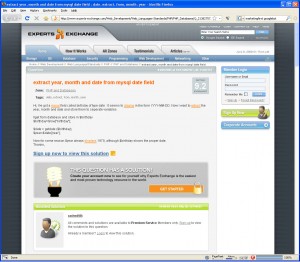
expert-exchange-screenshotHere is a screenshot of ExpertsExchange.com which shows a “false bottom”.

In this example the user visits the page expecting an answer to their question (in fact Google helped build this expectation by providing a link to the page in the first place), but the user is frustrated to find that they will have to sign up to view it!

But in fact, all they have to do is scroll to the bottom of the page to view the answer.

The promotional message “sign up now to view this solution” and the visual element of the lightbulb in the grey box have created a false bottom so the user doesn’t realise there is more content below.

(In this particular case it seems ExpertsExchange.com have done this on purpose to motivate visitors to become subscribers, while providing the actual answer for Googlebot to index)

In summary, do not be concerned with the length of your web pages. Instead, learn how to write for the web, and be conscious of not creating “false bottoms”.

Reasons Why Websites Are My Favourite Marketing and Advertising Medium

7 Reasons:

  1. Websites operate 24 hours a day, every day (I love the idea that you can make money or achieve your goals while you sleep!)
  2. Accessible from anywhere in the world
  3. Well written content is like having a team of non-pushy sales people simply providing the information and answering questions that potential customers are asking for
  4. Websites are cheap to build, and cheaper to run
  5. Websites are easy to update (unlike a brochure or a book that is out of date as soon as its finished printing!)
  6. It puts the user/customer in control (so it challenges you to get inside their head and figure out what makes them tick)
  7. It’s easy to get free traffic from Google searches

Are you this excited about your website? Is it time for fresh ideas?

Contact us today or book a free 45min consultation now

Essential Steps for Building a Website That Generates Business For You

8 Essential Steps:

  1. Define the most important action that you want the audience to take. Is it filling in an enquiry form? Call your toll free number? Download an information pack?
  2. Make it dead easy for them to take that action. 1 click or 2 clicks. Not 5 clicks
  3. Make your forms super short. Ask for essential information only. Not their age, not their gender, not even their address (if you aren’t posting them something, don’t ask for it). And it doesn’t matter if some of your form field aren’t compulsory, if it looks too long it will turn people away
  4. Ensure your code is search engine friendly:
    • Clean urls like “this-is-a-page-about-how-to-do-stuff.html” rather than “index.php?ss=2&s=abc”
    • Clean html code, eg use H1, H2, H3 tags instead of heavily formatted paragraph tags
  5. A stripped down CMS for commonly updated content (like blog entries, articles, products). Lock down other pages so you’re not tempted to wreck them with crazy fonts and colours
  6. Write for the web” by formatting all your content with headings, sub-headings, short paragraphs (none more than 3 sentences), bullet points, numbered lists, and internal hyperlinks
  7. Follow usability guidelines, such as:
    • Hyperlinks that look link hyperlinks. Buttons that look like buttons
    • Breadcrumbs so when the users deep-link they can quickly figure out where they are
    • Disable the hyperlink in the navigation if the user is already on that page
    • And just about everything else website usability guru Jacob Nielsen recommends
  8. Choose a web site developer who knows about all this stuff

Continue reading “Essential Steps for Building a Website That Generates Business For You”

How To Build A Website That Wins You Business

7 Steps for Building a Business-Winning Website

  1. Define the most important action that you want the audience to take. Is it filling in an enquiry form? Call your toll free number? Download an information pack?
  2. Make it dead easy for them to take that action
  3. Ensure your code is search engine friendly:
    • Clean urls like “this-is-a-page-about-how-to-do-stuff.html” rather than “index.php?ss=2&s=abc”
    • Clean html code, eg use H1, H2, H3 tags instead of heavily formatted paragraph tags
  4. A stripped down CMS for commonly updated content (like blog entries, articles, products). Lock down other pages so you’re not tempted to wreck them with crazy fonts and colours
  5. Write for the web” by formatting all your content with headings, sub-headings, short paragraphs (none more than 3 sentences), bullet points, numbered lists, and internal hyperlinks
  6. Follow usability guidelines, such as:
    • Hyperlinks that look link hyperlinks. Buttons that look like buttons
    • Breadcrumbs so when the users deep-link they can quickly figure out where they are
    • Disable the hyperlink in the navigation if the user is already on that page
    • And just about everything else website usability guru Jacob Nielsen recommends
  7. Choose a web site developer who knows about all this stuff

Other Important Things

  1. Ensure all your navigation is in one place (preferably displayed vertically on the left so it can scale as your website grows)
  2. Don’t have any animation or moving images at all. It distracts the user from completing their task