But even so, STOP IT!
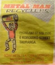
Here is an example in this weeks edition of the Bay News for Metal Man Recyclers, Koromiko Street, Tauranga.
This approach is classic, and very common… But still wrong!
The problem is there are 3 audiences:
- The business/advertiser (who is paying for the ads)
- The graphic designer who designed the ad
- The potential customer (people who read the Bay News in this case)
Each audience has a different agenda, and unfortunately the potential customer doesn’t get a say so the advertiser and the graphic designer work together to create the ad.
That’s a shame because the potential customers opinion is the only one that counts!
The graphic designer knows that if they create an ad with the advertisers brand name and logo at the top, the advertiser is going to be happy and will pay the bill. The graphic designer doesn’t care if the ad works or not, that’s not their business, it’s not their problem, they just do what they are told.
If your advertisement doesn’t work, what’s the point? It’s a waste of money if this ad doesn’t get customers in the door isn’t it?
The key to a great ad is a great headline, because it achieves 3 things:
- It filters out non-customers (if the headline doesn’t appeal to them, they move on. Fine, let them go!)
- It tells potential customers what’s in it for them (that’s all they care about. They don’t care about your brand, they care about what they can get from you)
- It hints at what action the customer can take
With those ideas in mind, I propose the following headlines for this ad:
- Old Car dumped on your lawn? We’ll take it away for FREE
- Got old car batteries, lead pipes, copper wire, aluminum cans etc? We pay cash for scrap metal. So check under your deck and in your shed today
So my message to Metal Man Recyclers, Koromiko Street, Tauranga is:
Change your headline to one of these, and put your brand name at the very bottom and only put your logo there if there is room.


I couldn’t agree more, the types of ads you mention target you much more specifically and if you have no interest you immediately turn off.
I completely agree with you. They really should have put their target message in the most visible area of their ad. After gaining potential customers interest, then you can make information search for consumers easy by placing details at the bottom of the ad.
Yes, thanks for your input Nathan.
Just stumbled upon your site today. Well worth a read and this post makes a great point. Interestingly it is well in line with what Google Adwords more-or-less forces you to do. Do you think the lesson works across platforms (Paper and Adwords) or does each platform have its own rules?
Great point Bradley. Yes, I think the same principles apply. Nowhere else are you forced to just 25 characters for a headline though (Google Adwords), thankfully we have more room in all other mediums for larger headlines 🙂
“The graphic designer doesn’t care if the ad works or not, that’s not their business, it’s not their problem, they just do what they are told.”
Dude, how wrong you are on this one! This is what defines good designers and good ads from bad designers and bad ads. Good designers care! Dammit! We care! Bad designs invariably come from the client who signs off shite like above…
Thanks for your point of view on this Andy 🙂
Not a bad read Sheldon. I have always found that the key ingredients to an effective print campaign that drive brand attitudes and encourage consumers into action have an:
– Evocative headline
– Eye catching imagery
– Clean, not cluttered
– Tight copy
– Prominent branding
– Clear call to action
I agree about the logo’s, they should not be at the top of an advert, the headline should take priority over the logo.
Cheers 🙂